Background
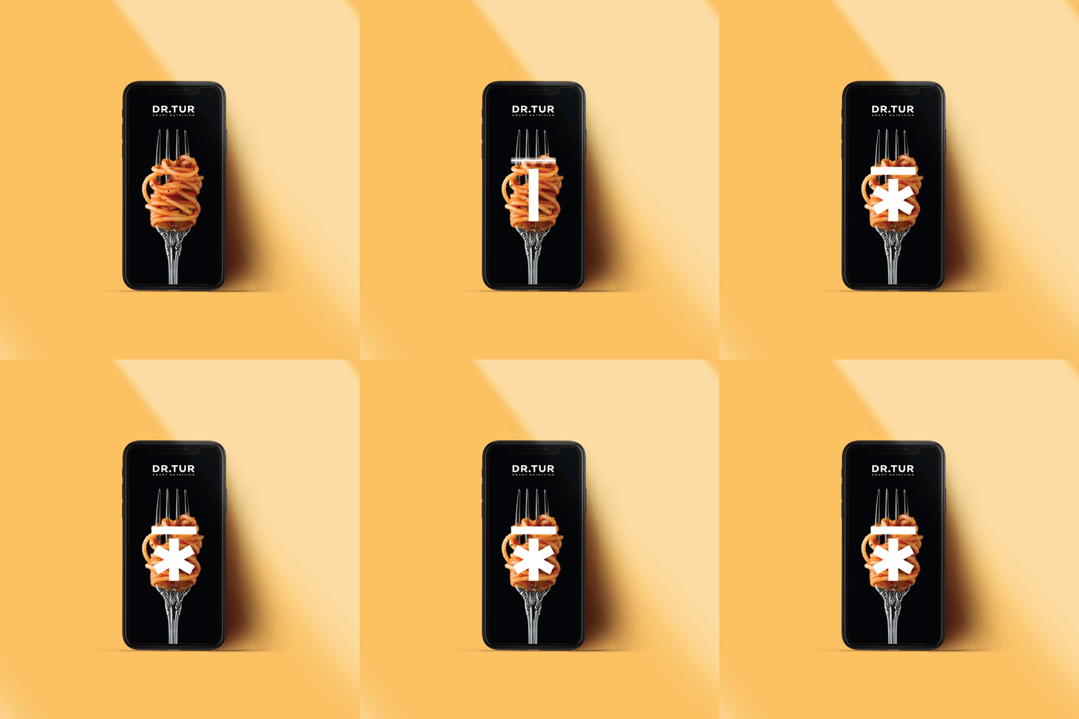
Dr. Tur is a nutritionist focused on wellness and healthy nutrition. The goal was to create a memorable symbol for his brand and sub-brands that could be easily recognizable across all formats and materials.
The asterisk is used as a reminiscence of wellness and the upper horizontal bar represents a T, the doctor´s name initial.
Client
Dr. Tur
Category
Nutrition
Sports
Wellness
Health
Services
Visual Identity System
Brand architecture
Art Direction


Brand system
The logotype is built around 4 sub-brands dedicated to a specific service: Smart Nutrition, Smart Horeca (hotels, restaurants and cafeteria), Smart Humana and Smart Alergias.
The brand uses the same icon to create brand awareness. A vivid color palette for each one of the services and an uppercase typography closes in a simple yet memorable brand system.


