BACKGROUND
Camaro is a coffee maker company located in Colombia. They make a wide range of coffee blends going from dark, light to medium roast . With the idea of expanding their business worldwide, they needed an approach that could fulfill their goals in a growing competitive market.
CLIENT
Camaro Café
CATEGORY
Coffee Shop
Cafeteria
SERVICES
Naming
Brand architecture
Packaging
Motion design
Art direction

NAMING
The name’s origin is an acronym: Café Masterfully Roasted. The combination of both English and Spanish comes from the idea of expanding their business all over the world without losing their Latin American roots.
Due to the owner’s love for muscle cars, it is also a tribute to the good old 1966 Chevy Camaro, one of the most iconic muscle cars ever created.

CONCEPT
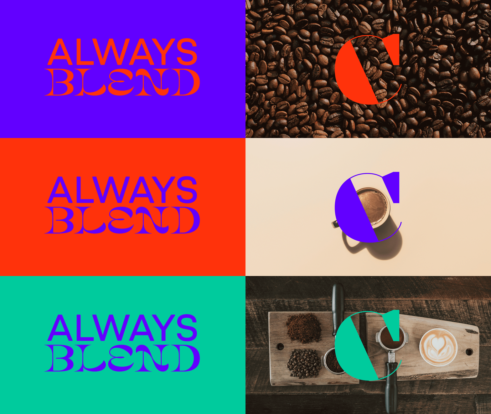
The core idea is to represent blending: flavours, nuances and tastes, but also the owner’s influence and culture, having both Colombian and American roots.
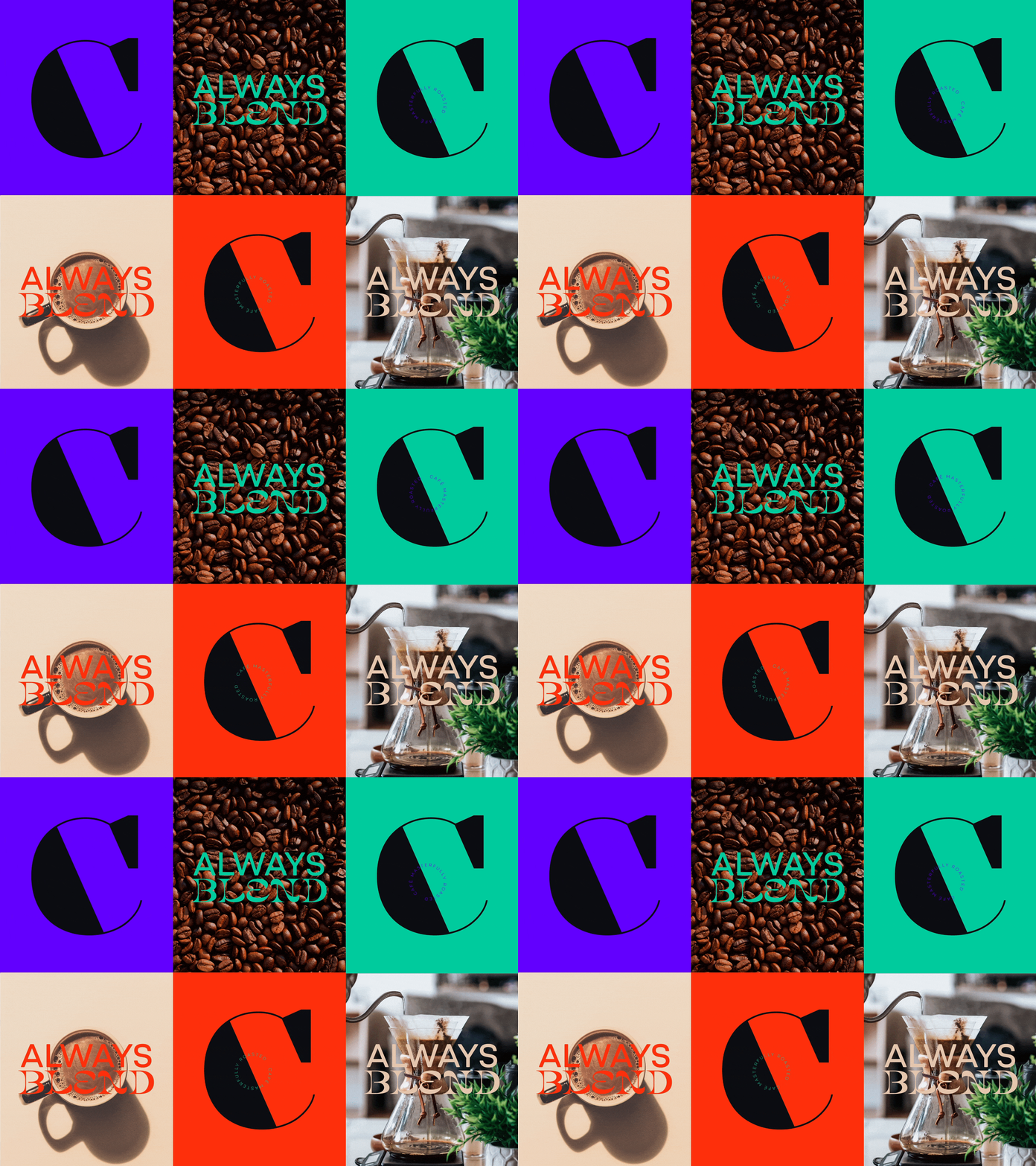
Under the tagline Always Blend, the result is a combination of different typographic styles that reflect the product’s variety, diversity and richness.
A vivid color palette, combined with black as background, results in a distinctive brand system full of charm and character.


PACKAGING
There are 3 varieties, each one with its own distinctive color: sweet (orange), smooth (green) and strong (violet). The idea of blending is reflected in the front of the packaging by combining highly distinctive typographic styles and a minimalistic approach to enforce it.
The typographic compositions steal the show: serif, sans serif, modern, classic types blend in a clean yet memorable way, in which black is used as the main background color to intensify the contrast with the joyful secondary colors.


